Overview
Over the course of three days, I was challenged to give OrganizeEmail a fresh user interface in preparation of the product launch. With the new interface, I needed to design an interface that would quickly show users the value of the application and creat customer retention. Unlike most other applications, the user only has five minutes of free organizing until they are prompted to pay for each additional minute. This meant that the userface had to be intuitive and visual compelling to quickly hook users.
The Challenge
The problem:Organizing your email can be overwhelming. How do I design an interface that is intuitive and provides the user with an enjoyable experience?
The Solution
By using a bold typeface, adding color, restructuring the layout, and adding visual cues, I am able to create an intuitive and playful experience.
How it works 💌
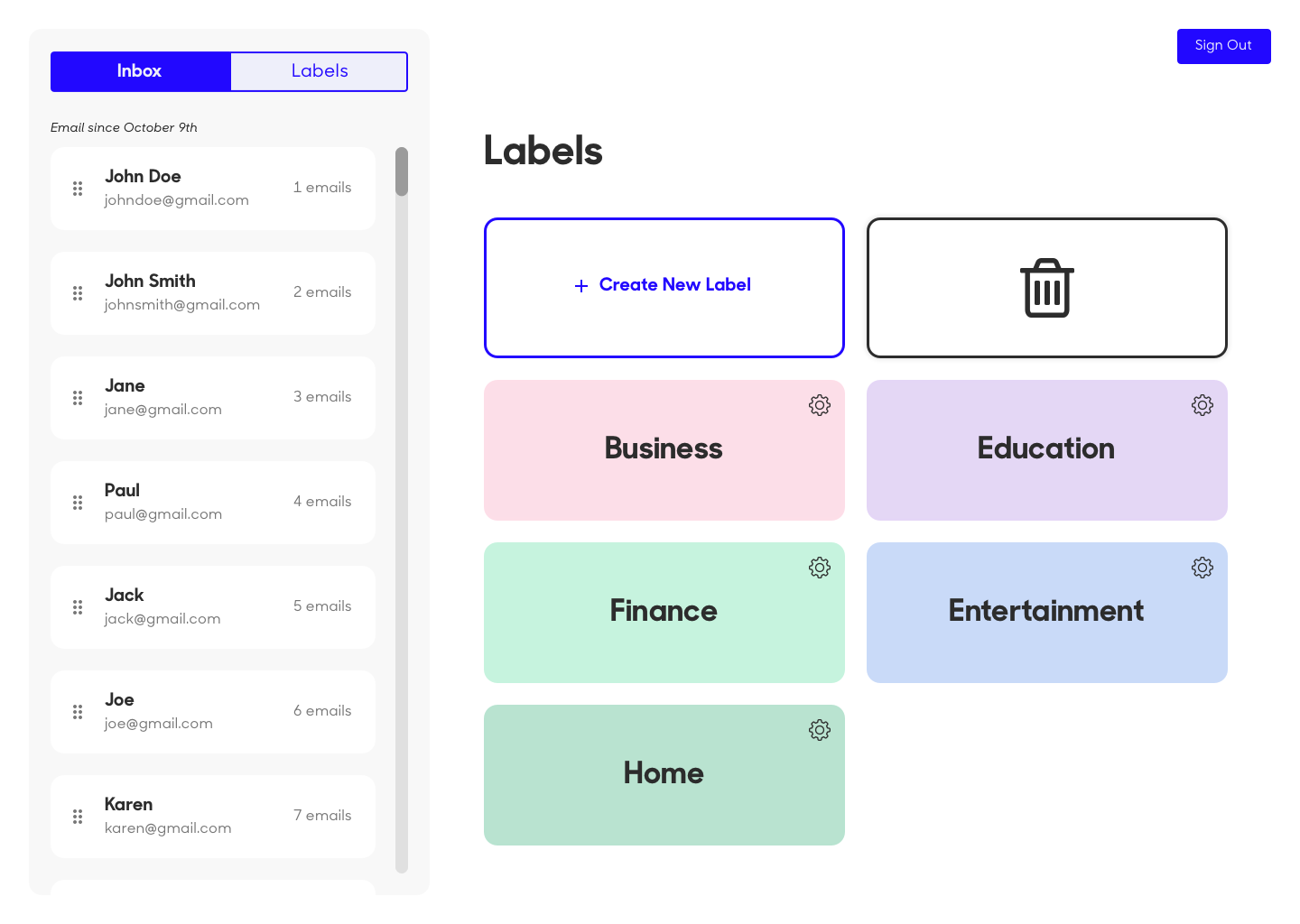
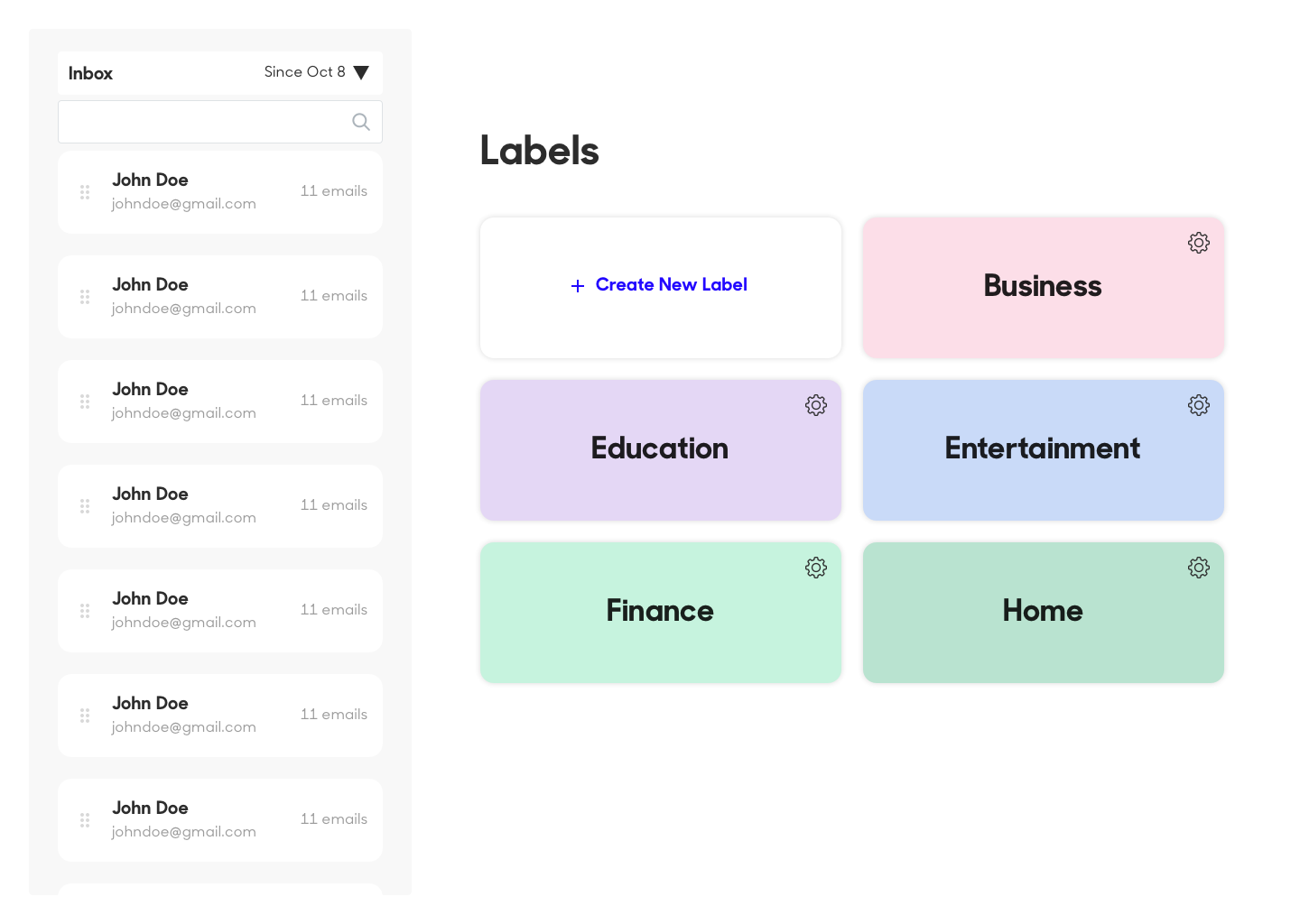
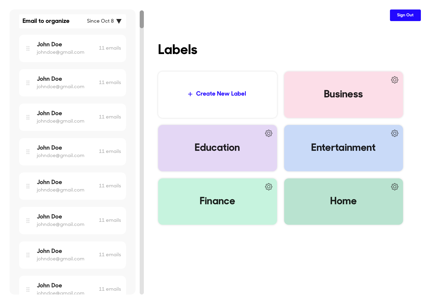
Dragging an email to a folder
In the left column, a user is able to select a contact and drag it into a label ( folder) on the right. The cards on the left let the user know who the contact is and how many emails they have received from the contact.

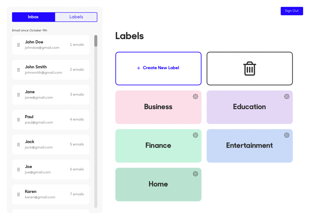
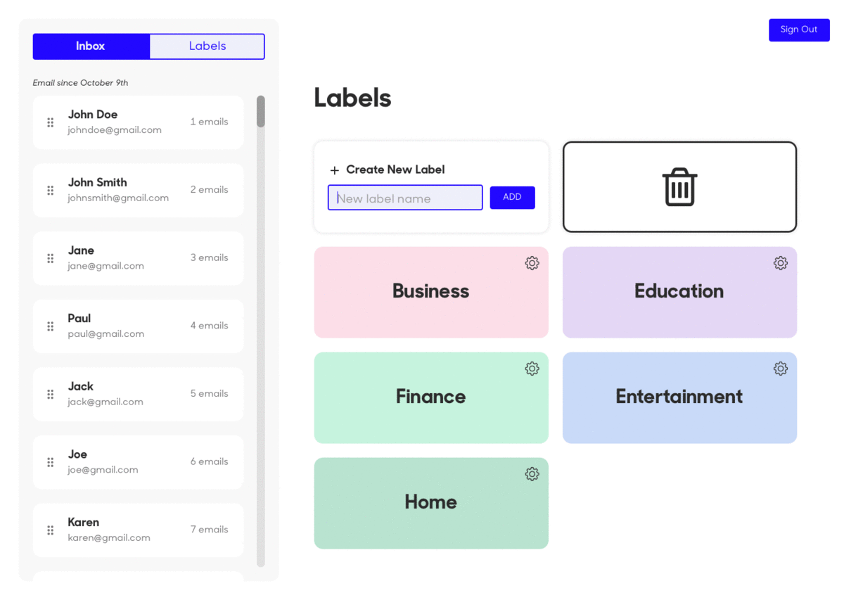
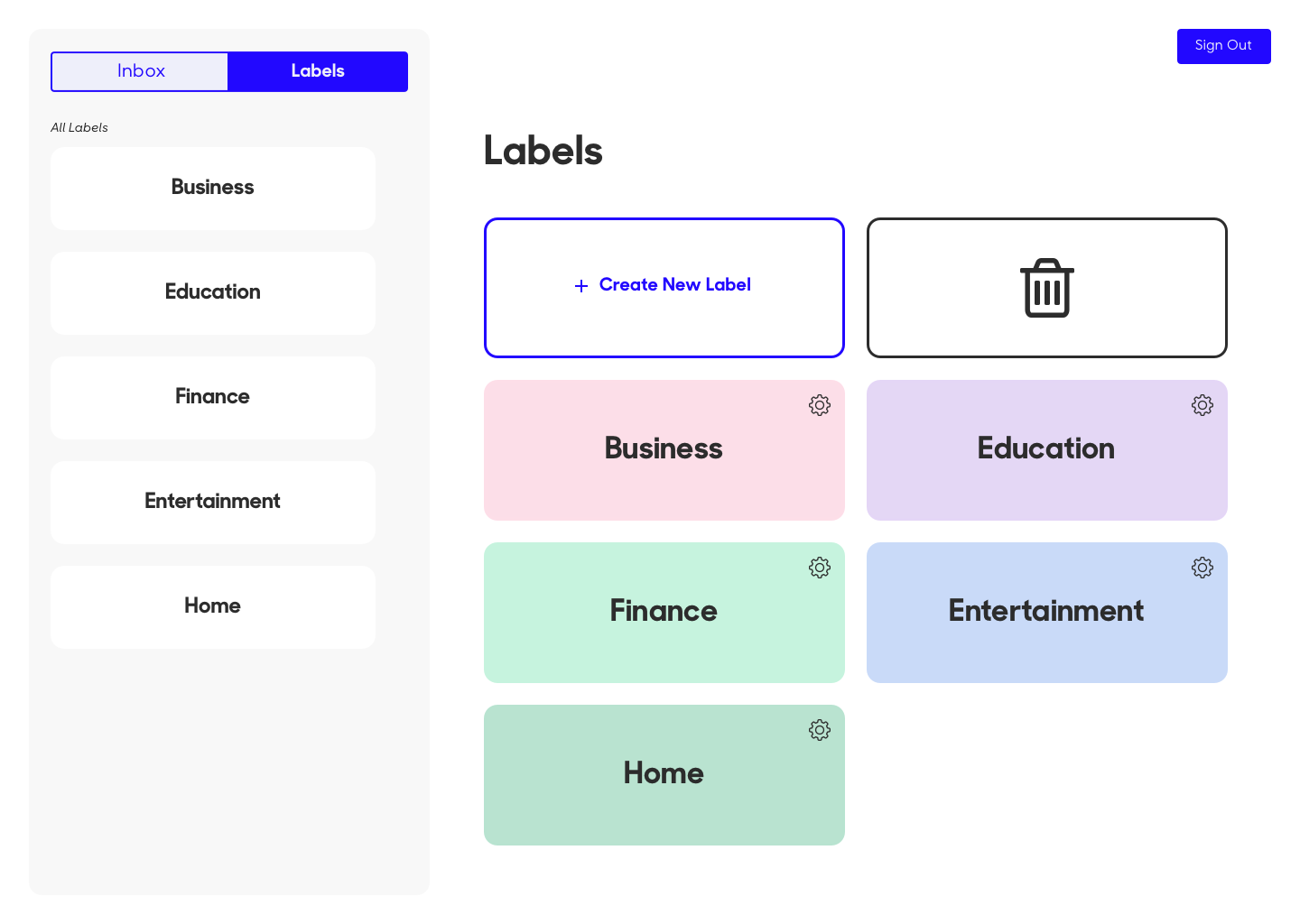
Creating a label
A user can quickly create a new label, which will be reflected in their Gmail account.
Labels
A user can switch between their inbox of unorganized emails and the labels to view the email they have already organized.

Ideation
Original Application
When I joined the project, they already had the structure laid out. It wasn’t my goal to rethink the bones of the application, but to make it visually compelling; enticing users to organize their email and do it in a fast manner.
I began the project by analyzing the current application and making notes of what I thought I could be improved.
Before I thought about establishing typography and a color scheme, I wanted to hash out the details.
Research 🔬
Comparative Analysis
After my analysis, I began to conduct research on existing applications to see what already existed and how those other applications could be improved. I was shocked when I only found a couple applications, with one recently shutdown. I was unable to conduct an analysis that would provide me with the information I needed, so I set out to learn more about Gmail.
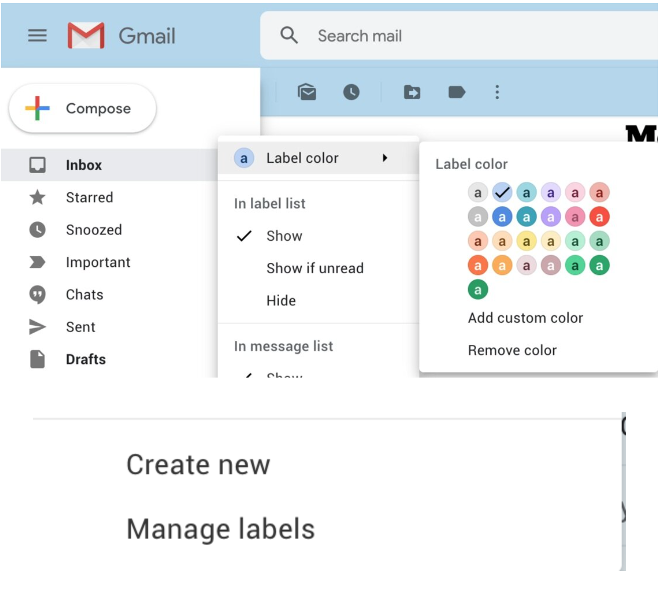
Gmail
For the initial launch of OrganizeEmail, it would only be used for Gmail accounts. This meant that the application should currently reflect Gmail and have similar colors & language.
Gmail used labels to describe the folders, inbox contains all of the addresses (senders), and a user is able to assign a color to a label.
The application would currently have limitations, not allowing a user to change the color within OrganizeEmail, but I still decided to use the colors provided.
What OrganizeEmail is doing, is automatically filtering emails into labels. This makes it so all future emails will be organized. This also posed a challenge- how do we let users know that all future emails will be automatically placed into labels they have created?
Additionally, how do we ensure users that OrganizeEmail is a trustworthy application? Throughout this project, I learned how to create design for what would mainly be a single-use application and learned the behind the scenes of launching a product. Since OrganizeEmail needed permission to access Gmail, there were many steps that application had to go through to be approved.
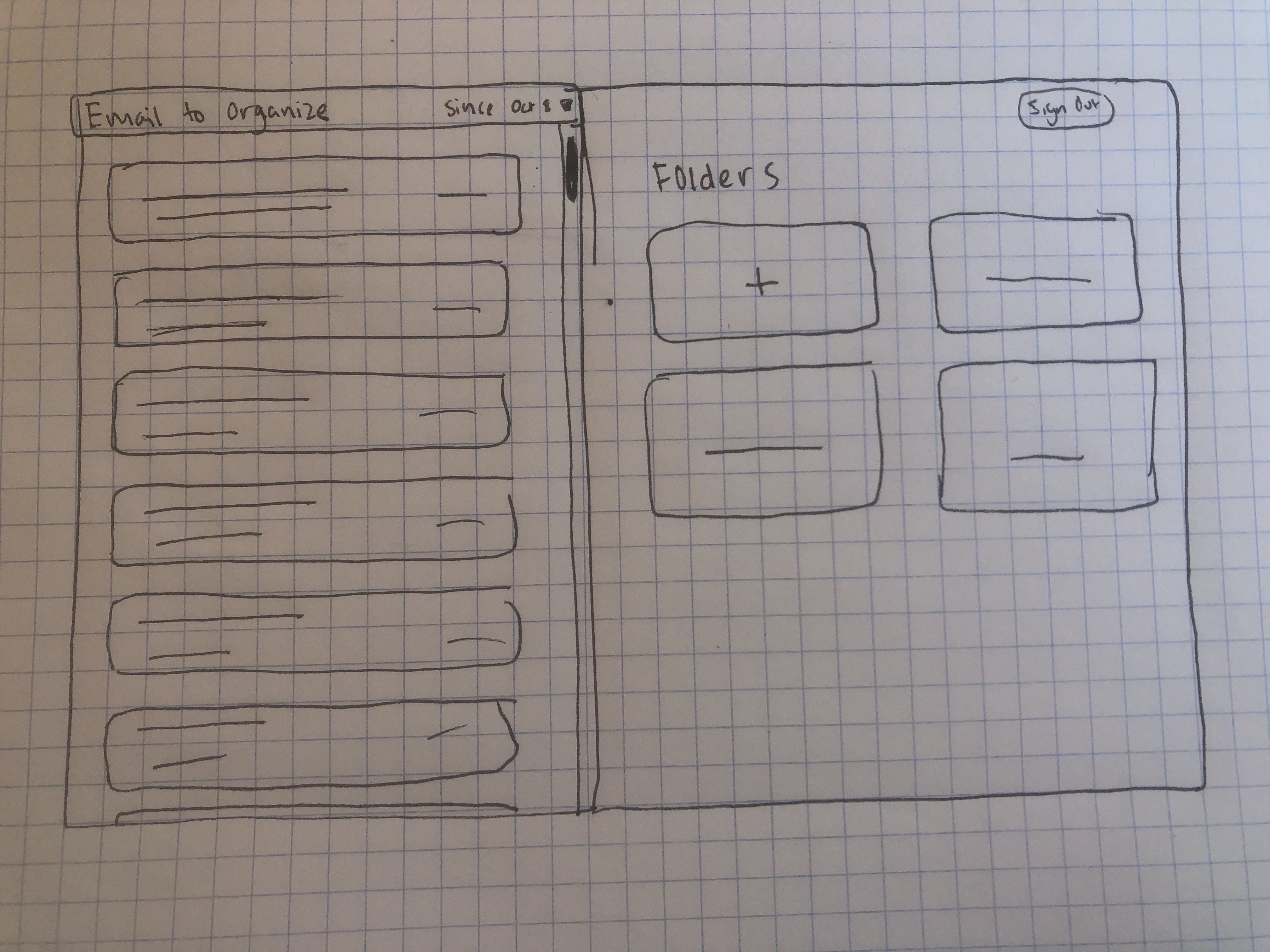
I quickly sketched out the new layout of the application before I began to create a hi-fidelity mockup. Since the application was already laid out structurally, I didn’t have to spend too much time on paper.
Design System
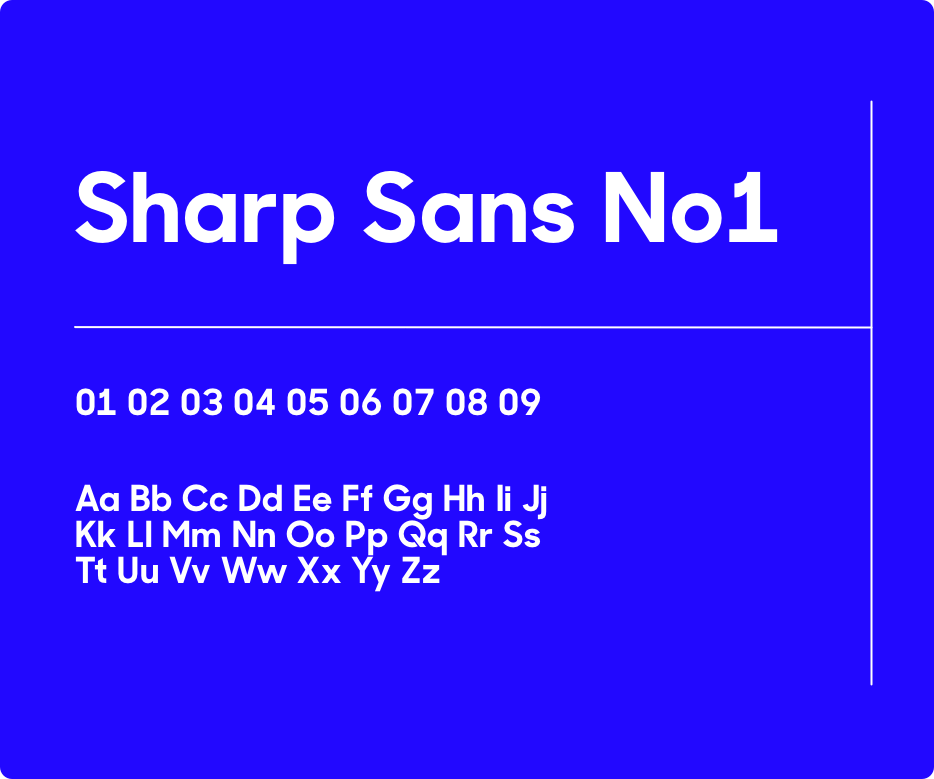
Typography
Colors
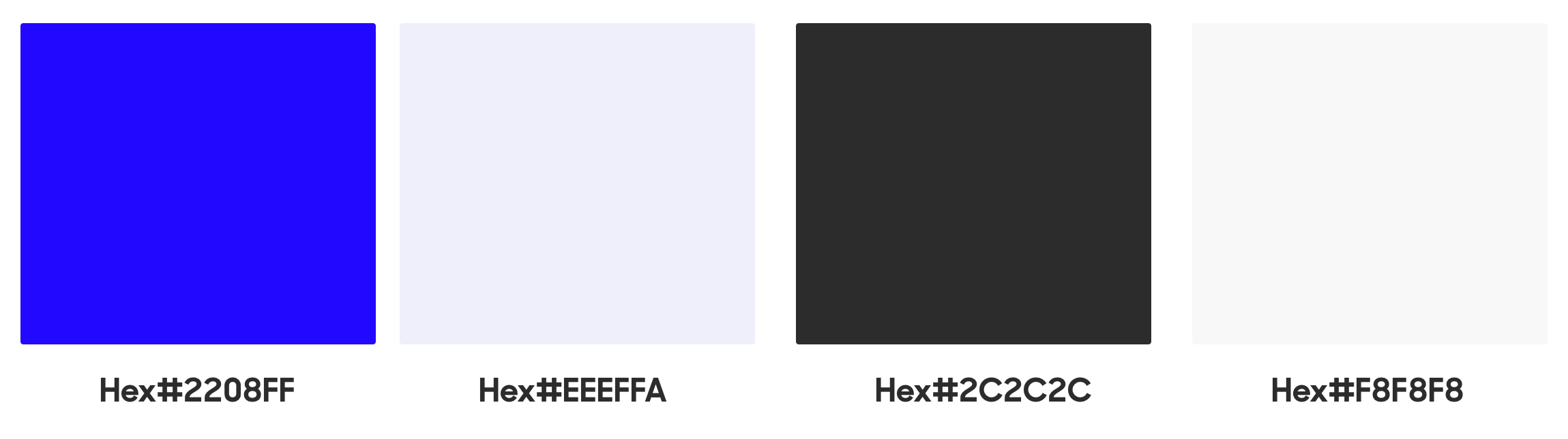
I wanted to keep OrganizeEmail clean and simple. I chose a bold blue as the primary color, with the goal to invoke feelings of calmness and trust. For the type, I chose Sharp Sans No1. I wanted a typeface that was bold, legible, and playful.
For the cards, I chose light pastels for the initial launch of the application. These colors were taken from the label colors in Gmail, because eventually the label colors in gmail should correlate to OrganizeEmail. If a user has a lot of labels ( such as myself), the different labels can become overwhelming. This is why I decided to use a unique color for each label, so that a user can quickly drag emails into a label. The colors above are the primary colors, and once a user has exceeded eight labels, different shades of the hues above would be assigned to a label.
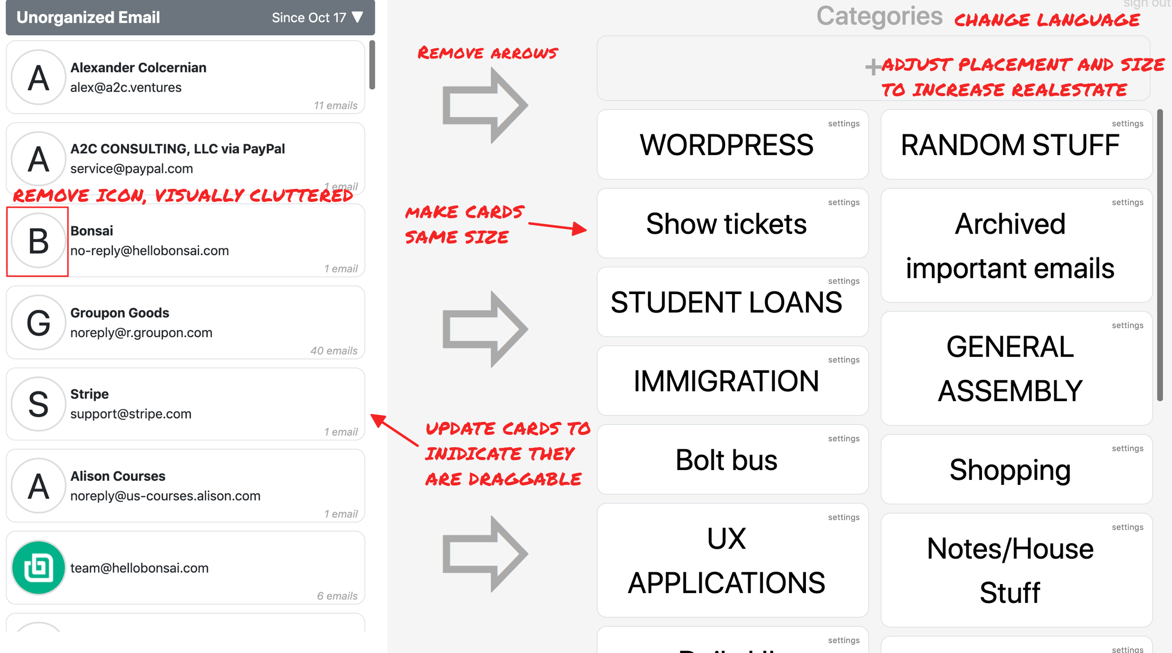
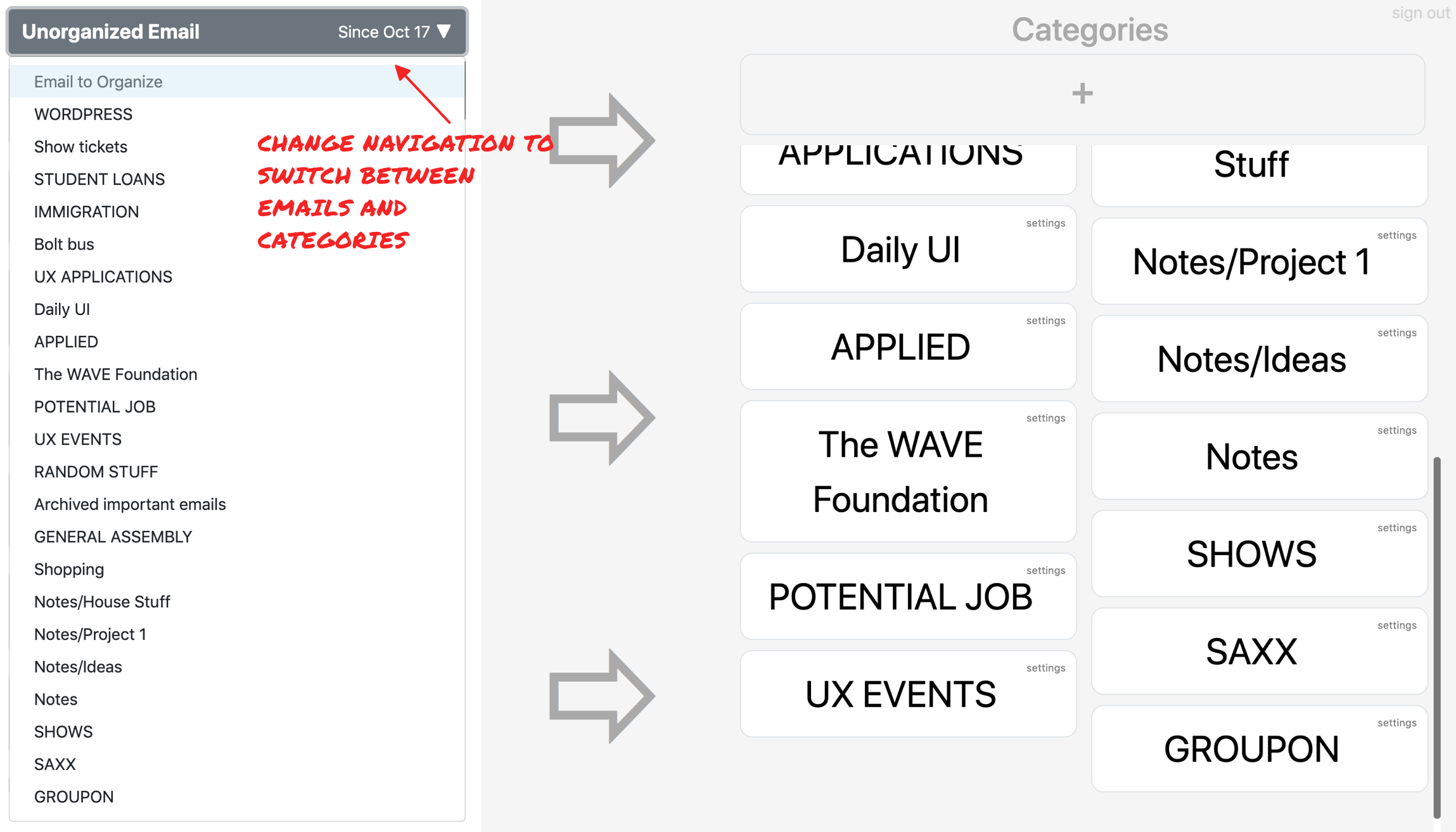
Above is my hi-fidelity mockup of the application. For the overall layout, I used an 8pt grid system to ensure consistency and make the application for accessible and appealing to users. For the unorganized emails, I consolidated the emails into a card, removed the avatar and added a drag icon as an indicator that the cards are draggable, and created a toggleable menu so a user can quickly switch between unorganized email and labels. For the labels, each card has a fixed size, I swapped out the settings text with an icon, decreased the size of the create new label CTA, and added a trash card so users could quickly delete email.
I went through some different iterations before I landed on the current layout. I initially wanted to add a search bar, but for first pass of the product I removed it.
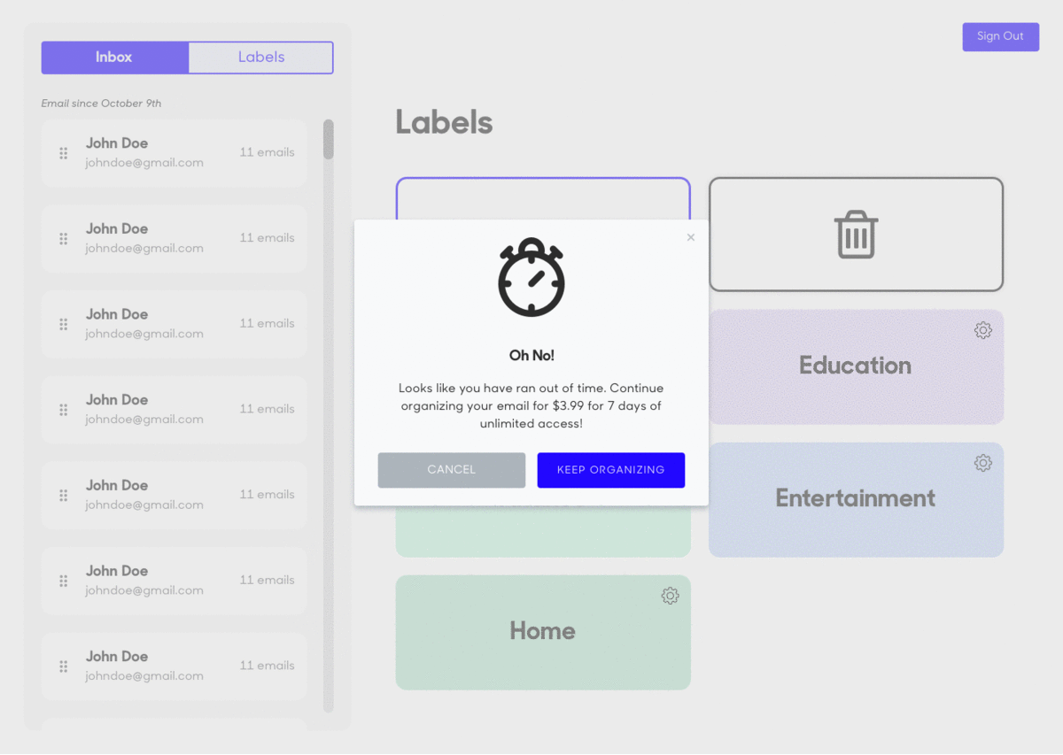
Payment Flow
During a second phase, after the initial facelift, I was brought back on to update the payment flow.
Reflection 🎉
This project was a tremendous learning experience. Working as the sole designer can be challenging, especially when you are newer to the field. Essentially, I was designing a single-use application that makes what most people consider a chore, a pleasurable experience. Throughout this process I developed and strengthened my skills as a freelancer and designer. I translated client needs, collaborated with engineering, hit deliverables under a tight deadline, developed a visually compelling landing page and application for on-boarding and retaining users, and gave OrganizeEmail it’s personality.